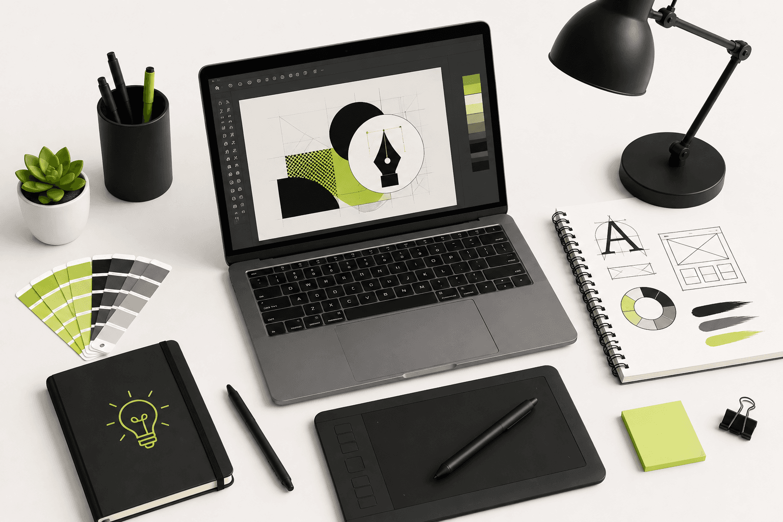
In a crowded digital marketplace, your brand often has only a few seconds to make an impression. Before a potential customer reads your website copy, compares your services, or explores your products, they are likely to notice your visual identity first. Your logo, colors, typography, images, social media graphics, website layout, advertisements, and other visual elements all contribute to how people perceive your business.
This is why graphic design for branding is much more than making something look attractive. Effective design helps a business communicate its personality, establish credibility, create recognition, organize information, and make its digital presence easier to understand.
Whether you are building a personal brand, launching an e-commerce store, running a startup, promoting professional services, or growing an established company, a consistent visual identity can make your brand easier to recognize and remember.
In this guide, we will explore 10 practical graphic design tips to make your brand stand out online. We will cover visual identity, typography, color systems, logo usage, social media design, website graphics, consistency, imagery, whitespace, accessibility, and practical ways to build a stronger digital brand.
Why Graphic Design Matters for Your Brand
Graphic design is one of the ways a business communicates without using words. A customer can often form an initial impression of a company based on its visual presentation before reading a single paragraph.
A professional and consistent visual identity can help communicate qualities such as:
- Trustworthiness.
- Professionalism.
- Creativity.
- Reliability.
- Premium positioning.
- Approachability.
- Technical expertise.
- Modernity.
Of course, design cannot replace a good product or service. A beautiful website with a poor customer experience will not create a successful business. However, strong graphic design can make good products, services, and content easier to discover, understand, and remember.
Tip 1: Build a Clear Visual Identity
The first step toward creating a recognizable brand is defining a visual identity.
Your visual identity is the collection of design elements that represent your business across different channels. It can include your logo, color palette, typography, photography style, illustration style, iconography, layout principles, graphic elements, and overall visual tone.
Without a defined visual identity, every new Instagram post, website banner, advertisement, presentation, and marketing graphic may look completely different.
That makes it harder for customers to recognize your content.
A basic brand identity system should define:
- Primary logo.
- Secondary logo or logo variation.
- Primary colors.
- Supporting colors.
- Primary typeface.
- Secondary typeface.
- Image direction.
- Icon and illustration style.
- Spacing principles.
- Social media design direction.
You do not need a huge brand guideline document when starting out. Even a simple, well-defined system can dramatically improve consistency.
Tip 2: Choose a Memorable Color Palette
Color is one of the fastest visual signals people associate with a brand.
A good color palette should not simply contain colors that look attractive individually. The colors should work together and support the personality and positioning of the brand.
For example, a technology company may use a different visual language from a children's brand, luxury fashion company, financial service, or creative studio.
A practical brand color system can include:
- Primary color: The main recognizable brand color.
- Secondary colors: Supporting colors used for variation.
- Accent color: Used to draw attention to important elements.
- Neutral colors: Backgrounds, text, borders, and supporting surfaces.
For example, a digital studio might use a strong accent color against a neutral black or white interface. This can create a distinctive appearance without requiring dozens of colors.
In many cases, fewer colors create stronger branding because the visual system becomes easier to recognize and reproduce.
Think About Contrast
Color selection should also consider readability. Text must have sufficient contrast against its background so that users can comfortably read it.
Do not choose colors only because they look good in a design application. Test them in the actual environment where customers will see them.
Tip 3: Use Typography as a Branding Tool
Typography is not just about selecting a font that looks nice. Typefaces can communicate personality and establish visual hierarchy.
A bold geometric typeface may feel modern and confident, while a traditional serif can create a more editorial or sophisticated impression.
For most brands, you do not need a large collection of fonts.
A simple system using one primary typeface and one supporting typeface is often enough.
Define styles for:
- Large headlines.
- Section headings.
- Body text.
- Navigation.
- Buttons.
- Captions.
- Labels.
Typography should remain consistent across your website, social media graphics, presentations, advertisements, and other branded materials.
Tip 4: Create a Logo That Works Everywhere
Your logo is an important part of your identity, but it should not be expected to communicate everything about your business by itself.
A strong logo should be recognizable, scalable, and practical.
Make sure your logo works across different environments, including:
- Website headers.
- Mobile navigation.
- Social media profiles.
- Business cards.
- Packaging.
- Advertisements.
- Favicons.
- Presentation slides.
- Video watermarks.
This is why many brands use multiple logo variations.
A horizontal logo may work well in a website header, while a simplified icon can work better as a favicon or social profile image.
Do not make the logo unnecessarily complicated. A simple mark that remains recognizable at small sizes is often more useful than a highly detailed design.
Tip 5: Design for Mobile First
A significant amount of digital content is consumed on smartphones. This means graphic design should account for small screens from the beginning rather than treating mobile as an afterthought.
When designing social media graphics, website banners, promotional images, and advertisements, check how the design looks at actual mobile dimensions.
Important information should remain easy to see without zooming.
Pay particular attention to:
- Font size.
- Text spacing.
- Button size.
- Image cropping.
- Contrast.
- Safe areas.
- Visual hierarchy.
A design that looks excellent on a large desktop monitor can become difficult to understand when reduced to a smartphone screen.
Tip 6: Use Strong Visual Hierarchy
Visual hierarchy determines what users notice first, second, and third.
Without hierarchy, every element competes for attention.
A good design guides the viewer through the content naturally.
You can create hierarchy through:
- Font size.
- Font weight.
- Color.
- Position.
- Spacing.
- Scale.
- Contrast.
- Image placement.
For example, a promotional graphic might have a large headline as the primary visual element, supporting information underneath, and a clearly visible call-to-action button.
The viewer should understand the main message without having to search through the design.
Tip 7: Use High-Quality Images
Photography can have a major influence on how professional a brand feels.
Low-quality, poorly cropped, irrelevant, or inconsistent images can make even a well-designed website appear less trustworthy.
When selecting images, consider:
- Resolution.
- Lighting.
- Composition.
- Color consistency.
- Subject relevance.
- Brand personality.
- Image cropping.
For e-commerce brands, product photography is particularly important because customers cannot physically inspect the product before purchasing.
High-quality product images can help communicate product details, materials, proportions, and overall presentation.
If your business needs professional product or brand photography, explore the Photography service by Built by Saurav.
Tip 8: Use Whitespace Intentionally
One of the most common graphic design mistakes is trying to fill every available space.
Whitespace, also called negative space, gives visual elements room to breathe.
It can improve:
- Readability.
- Visual hierarchy.
- Focus.
- Elegance.
- Navigation.
- Overall clarity.
Whitespace does not mean that the design has to be empty. It means that elements have enough space around them to be understood individually.
Premium brands often use generous spacing because it allows important elements to receive more visual attention.
Tip 9: Create Consistent Social Media Graphics
Social media is one of the most visible places where customers interact with a brand.
If every post uses completely different colors, fonts, layouts, and visual styles, the account can feel disconnected.
Create a recognizable social media design system.
For example, define:
- Post templates.
- Carousel layouts.
- Quote graphics.
- Educational post styles.
- Promotional graphics.
- Story templates.
- Reel cover designs.
- Announcement graphics.
Templates can save time while ensuring that content remains visually consistent.
However, consistency does not mean every post must look identical. Use the same visual language while allowing enough variation to keep the feed interesting.
Tip 10: Design With Your Audience in Mind
The final and perhaps most important principle is to design for the people you are trying to reach.
A design can be technically beautiful and still be ineffective if it does not match the expectations, needs, or preferences of the target audience.
Before designing a brand asset, ask:
- Who is going to see this?
- What do they need to understand?
- What action should they take?
- Where will they see the design?
- What visual language will they recognize?
- What competitors are they already familiar with?
Design should solve a communication problem rather than simply decorate a page.
Graphic Design for Website Branding
Your website is often one of the most important digital touchpoints for your brand.
Graphic design should therefore work together with the website's structure, typography, layout, animations, photography, and user experience.
Important website design elements include:
- Hero graphics.
- Section illustrations.
- Icons.
- Product imagery.
- Service graphics.
- Background patterns.
- Call-to-action sections.
- Testimonials.
- Case study visuals.
- Blog images.
These elements should feel like parts of the same brand rather than individual designs created independently.
If your website also requires custom development, explore the React & Next.js Development service for modern frontend experiences.
Graphic Design for E-Commerce Brands
E-commerce businesses have particularly strong reasons to invest in consistent graphic design because customers interact with many visual elements before making a purchase.
These can include:
- Homepage banners.
- Product images.
- Collection graphics.
- Promotional banners.
- Sale graphics.
- Social media advertisements.
- Email graphics.
- Packaging designs.
- Product comparison graphics.
- Instructional graphics.
Consistency across these touchpoints can make the customer journey feel more professional.
For brands running their online store on Shopify, professional design should also work naturally with the storefront's structure and user experience. You can explore the Shopify Development service if your store needs custom theme development or frontend improvements.
How to Make Your Brand Look More Premium
A premium appearance does not necessarily require expensive visual effects.
Often, premium design comes from discipline and consistency.
Focus on:
- Consistent spacing.
- Strong typography.
- High-quality imagery.
- Limited color usage.
- Clear hierarchy.
- Clean layouts.
- Purposeful details.
- Consistent branding.
Random gradients, excessive shadows, too many fonts, unnecessary effects, and cluttered layouts can make a brand look less professional rather than more premium.
Avoid Designing Everything From Scratch
Creative freedom is important, but a structured design system can make your workflow significantly more efficient.
Create reusable components and templates for common brand assets.
For example, a design system might contain:
- Headline styles.
- Body text styles.
- Button styles.
- Card layouts.
- Social post templates.
- Story templates.
- Banner layouts.
- Icon styles.
- CTA sections.
This approach makes it easier to maintain consistency while reducing repetitive design work.
Design for Accessibility
Good graphic design should be accessible to as many users as reasonably possible.
Consider users who may have visual impairments, color vision deficiencies, reading difficulties, or different device conditions.
Practical considerations include:
- Use sufficient color contrast.
- Do not communicate important information through color alone.
- Use readable font sizes.
- Avoid overly decorative body text.
- Provide meaningful alternative text for important website images.
- Maintain clear content hierarchy.
Accessibility is not only a technical requirement. It can also improve the overall usability of a design.
Optimize Graphics for the Web
High-quality graphics should also be optimized for website performance.
A visually impressive website can still provide a poor experience if it loads unnecessarily large images.
When preparing web graphics, consider:
- Image dimensions.
- File size.
- Image format.
- Compression.
- Responsive delivery.
- Lazy loading for appropriate below-the-fold images.
Modern formats such as WebP and AVIF can often provide efficient image delivery, depending on browser support and the delivery system being used.
Do not sacrifice visual quality unnecessarily, but also avoid serving a huge original image when a much smaller version would look identical at the displayed size.
Use Design to Support SEO
Graphic design and SEO may appear like separate disciplines, but they influence each other in several practical ways.
A well-designed website can improve usability, readability, navigation, and engagement. These factors contribute to the overall quality of the user experience.
Images should also be technically optimized with appropriate file sizes, meaningful filenames, responsive dimensions, and useful alternative text where appropriate.
However, design alone does not make a website rank higher in Google. Search visibility depends on many factors, including content relevance, technical SEO, crawlability, authority, links, structured data, and search intent.
The goal should be to combine strong design with strong technical and content foundations.
Create a Brand Style Guide
Once your visual identity is established, document it in a brand style guide.
A useful brand guide can contain:
- Logo usage rules.
- Logo spacing.
- Minimum logo size.
- Primary color values.
- Secondary color values.
- Typography.
- Photography direction.
- Iconography.
- Illustration style.
- Social media examples.
- Do's and don'ts.
The purpose of a brand guide is not to restrict creativity. It creates a foundation that allows different designers, developers, marketers, and content creators to produce work that still feels like the same brand.
Common Graphic Design Mistakes Brands Should Avoid
Even experienced businesses can make design mistakes when their visual identity grows without a clear system.
Common problems include:
- Using too many fonts.
- Using too many colors.
- Inconsistent logo placement.
- Low-resolution images.
- Poor contrast.
- Overcrowded layouts.
- Inconsistent social media graphics.
- Ignoring mobile screens.
- Overusing visual effects.
- Using generic stock photography everywhere.
- Ignoring whitespace.
- Designing without considering the target audience.
Fixing these issues does not always require a complete rebrand. Sometimes small improvements to typography, spacing, colors, imagery, and consistency can significantly improve the overall appearance.
Graphic Design and Video Content
Modern brands rarely communicate through static graphics alone. Social media often combines graphic design, photography, animation, and video.
Your graphic identity should therefore translate naturally into video.
For example, your brand typography and colors can appear in:
- Video captions.
- Motion graphics.
- Lower thirds.
- Intro screens.
- Outro screens.
- Social media video templates.
- Promotional animations.
This creates a stronger connection between your static and moving content.
If your business needs professional short-form content, promotional videos, social media edits, or branded video assets, explore the Video Editing service.
How to Build a Strong Brand From Scratch
If you are starting a new business, you do not need to create hundreds of assets immediately.
Start with the fundamentals:
- Define your target audience.
- Define your brand personality.
- Research competitors.
- Choose a visual direction.
- Create your logo.
- Select your colors.
- Choose typography.
- Define your imagery style.
- Create core templates.
- Apply the system consistently.
As the business grows, the visual system can evolve. Branding does not have to be completed in a single day.
Graphic Design for Personal Brands
Graphic design is equally important for individuals building a professional online presence.
Developers, designers, photographers, consultants, freelancers, creators, and founders can benefit from a recognizable personal visual identity.
Your personal brand may include:
- Personal logo or monogram.
- Portfolio design.
- LinkedIn graphics.
- Social media templates.
- Presentation designs.
- Case study graphics.
- Profile banners.
- Website visuals.
The goal is not to make yourself look like a large corporation. A personal brand should still feel authentic to the individual behind it.
Measure Whether Your Design Is Working
Visual design should ultimately support business objectives.
Depending on your goals, useful indicators may include:
- Website engagement.
- Conversion rate.
- Social media engagement.
- Profile visits.
- Website clicks.
- Lead generation.
- Product sales.
- Brand recognition.
If a redesigned landing page receives more qualified inquiries, or a new social media template increases saves and shares, the design is providing measurable business value.
Not every design decision will have an immediate measurable result, but connecting design to business objectives helps prevent visual decisions from becoming purely subjective.
A Practical Brand Design Checklist
Use this checklist when reviewing your current visual identity:
- Does the brand have a recognizable visual identity?
- Are the primary and secondary colors clearly defined?
- Are typography choices consistent?
- Does the logo work at small sizes?
- Are social media graphics consistent?
- Are website images high quality?
- Is there enough whitespace?
- Is visual hierarchy clear?
- Does the design work well on mobile?
- Is the text readable?
- Is color contrast sufficient?
- Are images optimized for web performance?
- Does the visual style match the target audience?
- Does the design communicate the brand personality?
- Does the same visual language appear across different platforms?
Final Thoughts
Making your brand stand out online does not mean adding more colors, more animations, more effects, or more complicated graphics. Strong branding often comes from making fewer design decisions and applying them consistently.
Start with a clear visual identity, choose a memorable color palette, establish typography, create a flexible logo system, design for mobile, use strong visual hierarchy, invest in quality imagery, respect whitespace, build consistent social media templates, and always design with your audience in mind.
The most effective graphic design is not simply attractive. It communicates quickly, supports usability, reinforces brand recognition, and helps customers understand what your business represents.
As your business grows, your visual identity can expand into websites, e-commerce stores, social media campaigns, advertisements, photography, packaging, video content, presentations, and other marketing materials.
If you need professional branding assets, social media graphics, advertisements, website visuals, marketing creatives, or custom graphic design, explore the Graphic Design service by Built by Saurav.
If your project also requires professional product or brand photography, explore the Photography service. For promotional content and social media videos, visit the Video Editing service.
For businesses that need a complete online presence, you can also explore the Shopify Development service or React & Next.js Development service for modern, responsive web experiences.
If you are planning a new website, rebrand, e-commerce store, or digital campaign, get in touch with Saurav to discuss your project and requirements.
Frequently Asked Questions
Why is graphic design important for branding?
Graphic design helps a brand communicate its personality and information visually. Consistent typography, colors, imagery, layouts, and graphic elements can make a business easier to recognize and can contribute to a more professional and trustworthy digital presence.
How can I make my brand stand out online?
Start by developing a distinctive and consistent visual identity. Use a focused color palette, memorable typography, high-quality imagery, strong visual hierarchy, consistent social media templates, and designs that are specifically created for your target audience and digital platforms.
How many colors should a brand use?
There is no universal number that works for every brand. A practical brand system often starts with one or two primary colors, supporting colors, an accent color, and several neutral colors. The important factor is how consistently and effectively the colors are used.
How many fonts should a brand use?
Most brands can create a strong visual system with one primary typeface and one supporting typeface. The key is establishing a clear hierarchy for headings, body text, navigation, captions, and other content rather than using many unrelated fonts.
Does a good logo make a brand successful?
A logo is an important part of a brand identity, but a successful brand depends on much more than its logo. Product quality, customer experience, messaging, positioning, service, reputation, marketing, and consistent visual communication all contribute to brand success.
Should my social media posts all look the same?
No. Social media content should have enough variation to remain interesting. However, using consistent typography, colors, imagery, layout principles, and graphic elements can help different posts feel connected to the same brand.
How important is photography in graphic design?
Photography can have a significant impact on the quality of a brand's visual communication. High-quality, relevant, and consistent images can make websites, advertisements, social media posts, product pages, and other marketing materials feel more professional.
Can graphic design improve website conversions?
Good design can support conversions by improving hierarchy, readability, navigation, trust, product presentation, and calls to action. However, conversion performance depends on many factors beyond visual design, including the offer, pricing, copywriting, usability, traffic quality, and overall customer experience.
Should a small business invest in professional graphic design?
Professional graphic design can be valuable for businesses that want to establish a strong and consistent visual identity. Small businesses do not necessarily need hundreds of branded assets; a focused identity system covering the logo, colors, typography, key templates, and important marketing materials can provide a strong foundation.
Can graphic design help with social media marketing?
Yes. Social media relies heavily on visual communication. Consistent and well-designed posts, advertisements, carousels, Reel covers, stories, and promotional graphics can help communicate information clearly and reinforce brand recognition across social platforms.