shopify developmentShopify Development

7 Custom UI Features That Instantly Increase Shopify Conversion Rates for DTC Brands

Discover 7 custom Shopify UI features that can increase conversion rates for DTC brands, including sticky add-to-cart, cart drawers, trust signals, bundles, urgency, and smart product experiences.

19 min read
Shopify Conversion Rate OptimizationShopify CROShopify UI DesignCustom Shopify UIShopify DevelopmentDTC EcommerceShopify Product PageShopify UXShopify Theme DevelopmentShopify LiquidEcommerce Conversion Optimization
7 Custom UI Features That Instantly Increase Shopify Conversion Rates for DTC Brands — Built by Saurav
7 Custom UI Features That Instantly Increase Shopify Conversion Rates for DTC Brands

Getting traffic to a Shopify store is only half the battle. The bigger challenge is turning that traffic into customers.

A DTC brand can have excellent products, strong social media campaigns, professional photography, and thousands of visitors every month — but if the storefront creates friction at the wrong moment, shoppers can still leave without purchasing.

This is where Shopify conversion rate optimization becomes important.

You don't always need a complete redesign to improve ecommerce conversions. In many cases, carefully selected custom Shopify UI features can remove friction, communicate value faster, improve product discovery, and make the path to checkout easier.

In this guide, we'll look at 7 custom UI features for Shopify stores that DTC brands can use to create a better shopping experience and potentially improve conversion rates.

These features are not meant to be installed blindly. The goal is to understand why each feature works, where it should appear, how it can be implemented in Shopify Liquid, and what mistakes can reduce its effectiveness.

If you're also working on storefront performance, combine these CRO techniques with our guide on fixing slow Shopify page speed. A conversion-focused UI should never come at the cost of a slow shopping experience.

What Is Shopify Conversion Rate Optimization?

Shopify conversion rate optimization (CRO) is the process of improving a Shopify storefront so that a higher percentage of visitors complete a desired action.

For an ecommerce store, the primary conversion is usually a purchase, but other important actions can include:

  • Adding a product to cart
  • Starting checkout
  • Using a product finder
  • Joining an email list
  • Using a promotional offer
  • Adding multiple products
  • Purchasing a subscription

The basic calculation is:

Conversion Rate =


    (Number of Conversions / Number of Visitors) × 100

For example, if 10,000 visitors generate 250 purchases:

(250 / 10,000) × 100 = 2.5%

The objective of CRO isn't simply to make every button larger or add more popups. Good CRO identifies where customers hesitate and removes unnecessary friction.

Why Custom UI Matters for DTC Shopify Brands

Many Shopify stores begin with a theme and gradually add apps, custom sections, promotional banners, reviews, upsells, badges, and tracking tools.

Eventually, the storefront can become visually crowded.

The problem is that every feature competes for the shopper's attention.

A strong DTC storefront should answer the customer's most important questions quickly:

  • What is this product?
  • Why should I buy it?
  • How much does it cost?
  • Is it available?
  • When will I receive it?
  • Can I return it?
  • Is the purchase trustworthy?
  • What should I buy with it?
  • What do I need to do next?

Custom UI allows these answers to be placed exactly where they matter instead of forcing customers to search through the page.

Custom UI vs Adding More Shopify Apps

One of the first questions brands ask is whether a feature should be built directly into the theme or installed through an app.

Factor Custom UI App
Design control Very high Depends on app
Theme integration Exact Variable
Performance control High Depends on implementation
Recurring cost Usually none Often applicable
Development effort Higher initially Lower initially
Long-term customization Excellent Limited by app

An app is often the right choice when a feature requires a sophisticated external service. But if the requirement is primarily frontend UI and business logic, custom Shopify theme development can provide better control.

Before adding another app, review our guide on Shopify apps and third-party performance.

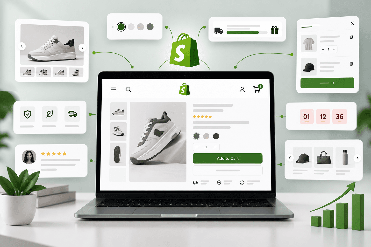
The 7 Custom Shopify UI Features

Here are the seven features we'll cover:

  1. Sticky Add to Cart
  2. Smart Cart Drawer With Free Shipping Progress
  3. Trust Signals and Benefit Highlights
  4. Interactive Product Variant Selection
  5. Bundle and Quantity Incentive UI
  6. Smart Product Recommendations
  7. Urgency and Availability Messaging

Each feature solves a different type of conversion friction.

1. Sticky Add to Cart Button

One of the simplest high-impact UI improvements for a Shopify product page is a sticky add-to-cart button.

On long product pages, customers may scroll through reviews, ingredients, specifications, product videos, FAQs, and comparison sections. By the time they decide to buy, the original add-to-cart button may be far above the viewport.

A sticky CTA keeps the primary action accessible.

Product Name

$79.00

★★★★★ 4.8/5

Choose your size → Add to Cart

The sticky bar should not replace the main product CTA. It should become visible after the primary CTA has moved out of the viewport.

How to Build a Sticky Add to Cart

Start with a simple HTML structure:

<div


    id = "StickyAddToCart"
    class= "sticky-atc"
    aria - hidden="true"
        >

    
{{ product.title }} {{ product.selected_or_first_available_variant.price | money }}

Then use JavaScript to determine when the primary add-to-cart form leaves the viewport.

const productForm = document.querySelector(


    '[data-product-form]'
    );

    const stickyBar = document.querySelector(
        '#StickyAddToCart'
    );

    if (productForm && stickyBar) {

        const observer = new IntersectionObserver(
            ([entry]) => {

                
    const isVisible = entry.isIntersecting;

    stickyBar.classList.toggle(
        'is-visible',
        !isVisible
    );

    stickyBar.setAttribute(
        'aria-hidden',
        String(isVisible)
    );

    }


    );

        observer.observe(productForm);
    }

This approach is better than displaying a sticky bar permanently because it avoids unnecessary UI duplication when the main CTA is already visible.

Make the Sticky CTA Mobile-Friendly

On mobile, the sticky add-to-cart bar must account for:

  • Small viewport widths
  • Browser navigation areas
  • Thumb-friendly button sizes
  • Variant selection
  • Sticky bars already present in the theme

Do not allow the sticky CTA to cover important content or create an awkward amount of screen obstruction.

For a broader product-page strategy, see our Shopify product page optimization guide.

2. Smart Cart Drawer With Free Shipping Progress

A cart drawer keeps customers on the current page instead of forcing them to navigate to a separate cart page.

But a basic cart drawer can be made much more useful by adding a free shipping progress bar.

For example:

Add $25 more to unlock free shipping.

After the threshold is reached:

🎉 You've unlocked free shipping!

This provides a clear shopping goal and can support higher average order values when combined with relevant recommendations.

Basic Liquid Implementation

{% assign threshold = section.settings.free_shipping_threshold | times: 100 %}


    {% assign remaining = threshold | minus: cart.total_price %}

    {% if remaining > 0 %}

    {% assign progress = cart.total_price
        | times: 100
            | divided_by: threshold
                %}

    {% if progress > 100 %}
    {% assign progress = 100 %}
    {% endif %}


Add {{ remaining | money }} more to unlock free shipping.

{% else %}

🎉 You've unlocked free shipping!

{% endif %}

The important part is to calculate the message from Shopify's actual cart state rather than hard-coding a value in JavaScript.

For a complete implementation, see our guide on building a custom Shopify cart drawer with a free shipping bar.

Don't Overuse Cart Upsells

The cart drawer should help customers complete their purchase, not overwhelm them with unrelated products.

A good rule is:

Use the cart drawer to reduce friction first and increase order value second.

Checkout should remain visually obvious.

3. Trust Signals and Benefit Highlights

Customers often hesitate because they don't have enough confidence to complete a purchase.

Trust signals can reduce uncertainty by answering common questions around:

  • Shipping
  • Returns
  • Guarantees
  • Product quality
  • Payment security
  • Customer support
  • Materials
  • Certifications, where applicable

Examples include:

✓ Free shipping over $100

✓ 30-day returns

✓ Secure checkout

✓ Ships within 24 hours

The key is to use real claims that the business can support. Trust UI should never be used to manufacture fake credibility.

Where Should Trust Signals Appear?

The most important locations are usually close to high-intent actions:

  • Below the price
  • Near the add-to-cart button
  • Near shipping information
  • Near the checkout CTA
  • Inside the cart drawer

Do not put every trust badge on every section of the page. Repetition can make the storefront look less credible rather than more credible.

Create Reusable Trust Blocks in Shopify

With Shopify's modern theme architecture, trust content can be implemented as reusable blocks or sections.

{


    "type": "text",
        "id": "trust_message",
            "label": "Trust message"
    }

Then the merchant can manage the content through the theme editor instead of changing Liquid code.

If you're working with Online Store 2.0, our guide on creating custom Shopify sections with Liquid schema explains how to build configurable components.

4. Interactive Product Variant Selection

Variant selection is one of the most important parts of a Shopify product page, but default dropdowns can create unnecessary friction.

For products with sizes, colors, materials, or other options, customers should be able to understand the choices quickly.

Instead of:

<select>


        < option > Small


You can create visual variant selectors.

Size

[ Small ] [ Medium ] [ Large ] [ XL ]

Color

[ Black ] [ White ] [ Blue ]

Variant Selection Should Show Availability

Don't make customers select a combination only to discover that it is unavailable after clicking add to cart.

Where the product data allows it, the UI should communicate unavailable combinations clearly.

<button


    type = "button"
    class="variant-option"
    data - option - value="Medium"
    {% unless variant.available %}
    disabled
    {% endunless %}
    >
        Medium
    

For products with multiple option combinations, a proper variant-selection system should determine the currently selected variant rather than simply enabling or disabling every option independently.

Show Variant-Specific Information

Depending on the product, variant selection may also change:

  • Price
  • Compare-at price
  • Product image
  • Availability
  • SKU
  • Subscription pricing
  • Shipping information

The UI should update these values when the customer selects a different variant.

5. Bundle and Quantity Incentive UI

Many DTC brands sell products where buying multiple units makes sense.

Instead of showing a simple quantity selector, you can create a quantity incentive component.

Choose your bundle

○ 1 item — $30

● 2 items — $54 Save 10%

○ 3 items — $72 Save 20%

This makes the value difference immediately visible.

For DTC brands, this can be particularly useful for consumable products, skincare, supplements, apparel basics, household products, and other categories where repeat purchases are common.

Avoid Fake Discount Presentation

If you show a "saving" amount, it should represent a real pricing difference.

For example:

Single:


    $30

    2 - Pack:
    $54

    Actual saving:
    $60 - $54 = $6

Don't create artificial urgency or fake discounts simply to increase conversions. Long-term trust is more valuable than a short-term click.

Build Quantity Tiers With Shopify Data

Depending on the implementation, quantity tiers can be represented through product data, metafields, theme settings, or dedicated bundle logic.

Metafields can be particularly useful when merchants need custom structured data associated with products.

Learn more in our Shopify metafields guide.

6. Smart Product Recommendations

Product recommendations can help customers discover products they might genuinely want to purchase.

But the key word is relevant.

A recommendation component should ideally answer:

"What else would make sense for this customer to buy right now?"

For example:

  • Shoes → socks
  • Camera → memory card
  • Skincare cleanser → moisturizer
  • Laptop → protective sleeve
  • Dress → matching accessories

Recommendation Placement Matters

Recommendations can appear on:

  • Product pages
  • Cart drawer
  • Cart page
  • Post-purchase experiences
  • Collection pages

However, the recommendation should not distract from the main conversion action.

On a product page, the primary product should remain the visual focus.

Keep Recommendations Fast

Recommendation widgets can introduce additional API requests, JavaScript, images, and DOM elements.

For performance-sensitive storefronts, load secondary recommendation content only when it becomes relevant.

This is especially important if the store already has a large amount of third-party functionality.

Our Shopify page speed optimization guide explains how to identify unnecessary frontend work.

7. Urgency and Availability Messaging

Urgency can encourage customers to act when there is a legitimate reason to act now.

Examples include:

  • Limited inventory
  • Sale ending at a defined time
  • Order cutoff for same-day shipping
  • Upcoming promotion deadline
  • Seasonal availability

For example:

Only 4 left in stock

Order within 2h 15m for today's shipping cutoff.

These messages can reduce hesitation when they communicate real information.

Don't Use Fake Countdown Timers

Fake countdown timers that reset every time the page loads can damage customer trust.

If a timer is used, it should represent a genuine event such as:

  • A real campaign end time
  • A real shipping cutoff
  • A real promotional deadline
  • A genuine inventory or reservation window

Authenticity is an important part of DTC ecommerce UX.

How These 7 Features Work Together

The strongest Shopify CRO strategy doesn't treat these components as isolated widgets.

They can work together as one conversion journey:

Landing Page
    ↓


    Clear Product Value
    ↓
    Trust Signals
    ↓
    Variant Selection
    ↓
    Bundle / Quantity Incentive
    ↓
    Add to Cart
    ↓
    Cart Drawer
    ↓
    Free Shipping Progress
    ↓
    Relevant Recommendation
    ↓
    Checkout

Each component addresses a different question or source of friction.

The Most Important Rule: Don't Add UI Just Because You Can

More UI does not automatically mean more conversions.

Every component competes for attention.

Imagine a product page containing:

  • Sticky add-to-cart
  • Countdown timer
  • Exit popup
  • Newsletter popup
  • Review popup
  • Discount banner
  • Free shipping bar
  • Five trust badges
  • Three recommendation carousels
  • Chat widget

The result may be a storefront where the customer doesn't know what to focus on.

The goal of CRO is therefore not:

Add more elements.

The goal is:

Remove friction and make the next action obvious.

Design the Above-the-Fold Product Experience Carefully

The first viewport of a product page should communicate the core value proposition quickly.

A strong structure can look like:

Product Images
    ↓


    Product Name
    ↓
    Rating / Social Proof
    ↓
    Price
    ↓
    Short Value Proposition
    ↓
    Variant Selection
    ↓
    Shipping / Trust Information
    ↓
    Add to Cart

Customers should not have to scroll halfway down the page to understand how to purchase the product.

Use Visual Hierarchy to Improve Shopify UX

Visual hierarchy determines what shoppers notice first, second, and third.

For an ecommerce product page, a typical hierarchy is:

  1. Product
  2. Value
  3. Price
  4. Selection
  5. CTA
  6. Trust
  7. Supporting information

If every element uses a large font, bright background, animation, or badge, nothing becomes visually important.

Good UI uses contrast and spacing intentionally.

Build Conversion Features as Reusable Shopify Sections

If you are developing a custom Shopify theme, build CRO components as reusable sections or snippets instead of embedding everything into one massive product template.

For example:

sections/


    ├── main - product.liquid
    ├── sticky - add - to - cart.liquid
    ├── trust - benefits.liquid
    ├── product - bundles.liquid
    └── recommendations.liquid

    snippets /
    ├── trust - item.liquid
    ├── variant - picker.liquid
    └── shipping - progress.liquid

This makes the storefront easier to maintain and allows individual features to be reused across multiple templates.

For more on Shopify's theme architecture, read our guide on Shopify theme architecture.

Use Shopify Theme Settings Instead of Hard-Coding Everything

A professional custom theme should allow merchants to control important CRO components through the Shopify theme editor.

For example:

{


    "type": "checkbox",
        "id": "enable_sticky_atc",
            "label": "Enable sticky add to cart",
                "default": true
    },
    {
        "type": "checkbox",
            "id": "enable_trust_badges",
                "label": "Enable trust benefits",
                    "default": true
    }

This gives the merchant control over which features are active without requiring a developer for every change.

If you're modifying an existing theme, follow our Shopify theme customization best practices to reduce the risk of breaking existing functionality.

Optimize CRO Features for Mobile Shopify Stores

Mobile ecommerce requires special attention because the available screen space is limited.

On mobile:

  • Keep CTA buttons easy to tap.
  • Don't cover the product image with sticky elements.
  • Keep variant selectors compact but understandable.
  • Make cart drawer scrolling smooth.
  • Keep checkout CTA visible.
  • Avoid intrusive popups.
  • Minimize unnecessary animations.

Always test custom UI on actual mobile devices, not only desktop browser emulation.

Don't Sacrifice Shopify Page Speed for CRO

One of the biggest mistakes brands make is adding conversion features without considering performance.

For example, a single sticky CTA may have minimal impact. But adding multiple apps for reviews, personalization, recommendations, popups, countdowns, bundles, analytics, and chat can create a large amount of JavaScript.

That can negatively affect the shopping experience.

Before adding a new feature, ask:

  • Does this solve a real customer problem?
  • Can it be built directly into the theme?
  • Does it require third-party JavaScript?
  • Can it load only when needed?
  • Will it increase DOM complexity?
  • Does it affect LCP, INP, or CLS?
  • Can the same goal be achieved with simpler UI?

For deeper performance work, see our articles on Core Web Vitals and why Shopify stores become slow.

How to Measure Whether a UI Feature Actually Works

You should never assume that a UI feature increased conversions simply because it looks better.

Measure the relevant funnel events.

Feature Useful Metric
Sticky Add to Cart Add-to-cart rate
Cart Drawer Checkout initiation
Free Shipping Bar Average order value
Trust Signals Purchase conversion
Variant UI Variant selection / add-to-cart rate
Bundle UI Units per order / AOV
Recommendations Attach rate / revenue per visitor
Urgency Messaging Conversion rate

Whenever possible, compare performance against a baseline and test one meaningful change at a time.

A/B Testing Shopify UI Features

If your traffic volume supports experimentation, A/B testing can help determine whether a change actually improves the business metric you care about.

For example:


        Control:
        Standard Add to Cart
        Variant:
        Sticky Add to Cart
        Compare:
        Add - to - cart rate
        Checkout initiation
        Purchase conversion
        Revenue per visitor
    

Do not judge a test only by clicks. A sticky button could increase add-to-cart clicks while producing no improvement in completed purchases.

The ultimate objective is better business performance, not simply more interaction.

Use Customer Behavior to Decide What to Build

The best CRO features are based on evidence.

Useful sources of evidence include:

  • Analytics data
  • Conversion funnel reports
  • Customer support questions
  • Product reviews
  • Session recordings
  • Heatmaps
  • Search queries
  • Abandoned cart patterns
  • Customer interviews

For example, if customers repeatedly ask about delivery times, a shipping information component may be more valuable than another promotional popup.

If customers repeatedly reach the bottom of a long product page and then scroll back to the CTA, a sticky add-to-cart could be a logical experiment.

CRO Is About Removing Friction, Not Manipulating Customers

There is an important difference between persuasive design and deceptive design.

Good ecommerce UI:

  • Explains the product clearly.
  • Makes pricing transparent.
  • Communicates real shipping information.
  • Shows genuine reviews.
  • Explains returns.
  • Makes checkout easy.
  • Recommends relevant products.
  • Communicates real scarcity when it exists.

Bad UI uses misleading countdowns, hidden costs, fake scarcity, confusing buttons, or intentionally difficult cancellation flows.

For DTC brands that want repeat customers, trust should be treated as a conversion asset.

Recommended Shopify CRO Priority Order

If you're improving an existing store, don't implement all seven features simultaneously.

A practical order is:

  1. Fix basic product-page usability.
  2. Improve the primary add-to-cart experience.
  3. Add relevant trust information.
  4. Improve variant selection.
  5. Improve cart UX.
  6. Add free shipping or bundle incentives.
  7. Add relevant recommendations.
  8. Experiment with legitimate urgency messaging.

This order focuses first on the fundamentals before adding more sophisticated merchandising features.

A High-Converting Shopify Product Page Structure

A custom DTC product page could use a structure like:

<Product Gallery>
    
    ├── Product Title
    ├── Rating
    ├── Price
    ├── Value Proposition
    ├── Variant Selector
    ├── Quantity / Bundle Selector
    ├── Shipping Information
    ├── Trust Benefits
    └── Add to Cart


The exact structure depends on the product category and brand, but the important actions should remain easy to find.

Build UI Components With Shopify Liquid + JavaScript

Liquid should handle server-rendered product information while JavaScript should handle interactions.

For example:

Liquid:
        * Product title
        * Price
        * Variants
        * Availability
        * Images
        * Trust content

        JavaScript:
        * Variant interaction
        * Sticky CTA visibility
        * Cart requests
        * Quantity changes
        * Drawer interactions
        * Dynamic UI states

This separation keeps the theme architecture easier to maintain.

For a deeper understanding of Liquid itself, see our Shopify Liquid objects, tags, and filters guide.

Keep Custom CRO Features Compatible With Shopify Updates

Customizations should be implemented in a way that minimizes unnecessary changes to core theme functionality.

Use:

  • Dedicated sections
  • Reusable snippets
  • Data attributes
  • Scoped CSS
  • Modular JavaScript
  • Theme settings
  • Clear naming conventions

Avoid scattering random inline JavaScript and CSS throughout product templates.

For a safer development workflow, read our guide on adding custom CSS and JavaScript to Shopify themes safely.

Shopify CRO Audit Checklist

Use this checklist when reviewing a DTC Shopify store:

  • Is the product value proposition immediately clear?
  • Is the price easy to find?
  • Is the primary CTA obvious?
  • Can customers add products without unnecessary steps?
  • Are variants easy to understand?
  • Is availability clear?
  • Are shipping details easy to find?
  • Are returns explained?
  • Are trust signals genuine?
  • Does the mobile layout work correctly?
  • Does the cart update without unnecessary page reloads?
  • Does the cart drawer provide useful information?
  • Is free shipping progress clear if applicable?
  • Are recommendations relevant?
  • Are discounts presented honestly?
  • Is urgency based on real information?
  • Are third-party scripts minimized?
  • Are Core Web Vitals monitored?
  • Are UI experiments measured?

7 Shopify UI Features at a Glance

Feature Primary Goal Best Location
Sticky Add to Cart Reduce CTA friction Product page
Cart Drawer Simplify cart experience Site-wide
Trust Signals Reduce hesitation Product / cart
Variant UI Simplify selection Product page
Bundle UI Increase AOV Product page
Recommendations Cross-sell Product / cart
Urgency Messaging Reduce delayed decisions Product / campaign pages

Final Thoughts

The best Shopify conversion rate optimization strategies don't depend on adding dozens of flashy features. They focus on understanding where shoppers hesitate and building a cleaner path from product discovery to checkout.

For DTC brands, seven particularly useful custom UI opportunities are:

  1. Sticky Add to Cart to keep the primary CTA accessible.
  2. Smart Cart Drawer to simplify cart interactions and communicate free shipping progress.
  3. Trust Signals to reduce purchase hesitation.
  4. Interactive Variant Selection to make product configuration easier.
  5. Bundle and Quantity Incentives to increase units per order when appropriate.
  6. Relevant Recommendations to improve product discovery and cross-selling.
  7. Legitimate Urgency Messaging to communicate genuine deadlines and availability.

The most important part is not the feature itself. It is how, where, and why you implement it.

A custom Shopify storefront should balance conversion optimization with accessibility, performance, SEO, maintainability, and brand consistency.

If your Shopify store needs custom CRO features, Liquid development, high-performance theme customization, or a complete ecommerce UI rebuild, explore our Shopify development services.

You can also explore our portfolio to see examples of our development work.
For the next stage of optimization, combine these CRO improvements with our guides on Shopify technical SEO, Shopify image optimization, and Shopify theme architecture.

About the author

Saurav Prajapati

Shopify & Frontend Developer sharing practical experience with Shopify, Liquid, React, Next.js, APIs, and modern web development.

Share this article